I’m reading MEX’s Manifesto at the moment, and I’d like to bring two of the agenda issues together and consider what Coverflow-style visual browsing could add.
First– “Content itself will be the interface of the future”. It talks of “…stripping away the confusion and clutter of traditional interface items…”.
Second – “Intelligent contact lists are the future centres of the user interface”.
It seems strange that mobile manufacturers are so eager to try out new hardware designs, but that software interfaces see so little innovation. The styling may change but essentially we’re still left with lists detailing your texts, email, music, contacts, etc. Notable exceptions are the ever-changing S60 multimedia interface and Coverflow on the iPhone.
Innovation in interface design should consider what users do with their device, in terms of the contexts in which they use them. I believe that the strong visual clues as allowed by Coverflow browsing could be extended to scenarios other than choosing music by album covers.
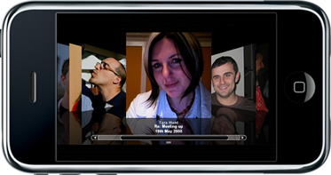
Take email for example – the action is that I’m “replying to an email”, but the context is that I’m “engaged in a conversation”. So why not show me those people with whom I’m coversing? Coverflow could be implemented in the iPhone’s Mail application; by showing a picture of the person, my email would become a visual flickthrough of people that I’m chatting to.
The email subject and date could be added below the contact, and visual clutter could be reduced by threading. Arrange by the date of last reply, and you have an easily understandable but fresh way of viewing your email. The same could easily apply to SMS/MMS and (forthcoming) IM applications.
But this could also be taken a step further. The iPhone “Phone” menu item contains the following options:
* Favorites
* Recents
* Contacts
* Keypad
* Voicemail
With the obvious exception of the Keypad, all of the above lend themselves to Coverflow browsing. Recents, in particular, could be expanded to incorporate all communications. These are already date-arranged, and could serve as an entry point for unread and recent items, whether they are emails, SMS or voicemail. Tap on the photo of your contact to reveal the communication history, no matter what the medium. There’s already something along those lines for Windows Mobile – see this post at Gizmondo for more.
Coverflow does not have to be the default view, and indeed would alienate some. But as an option (by turning the device on its side), it would provide a new and perhaps more intuitive way of managing your messaging. This is part of adding intelligence to your contacts lists (they are the centre of the mobile in my opinion), by turning contacts into an entry point that records *all* your conversations with your social network.
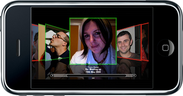
Then add presence into the mix. Communication history is combined with availability. Again, Coverflow could provide an added visual indicator – highlight the person’s photo green if they are available, red if they are not.
I don’t think this sort of visual browsing works for everything, but for people in particular, visual clues are very strong.
—
This article was inspired by the original Coverflow for People post at http://factoryjoe.com/blog/2007/11/06/coverflow-for-people/ (from where I also pinched and used the image)